Add a Subtle Shake Effect to Your Website With CSS Animations
in Web Dev
After finishing Net Ninja's CSS tutorial on YouTube, I figured out how to add a subtle shake to any element.
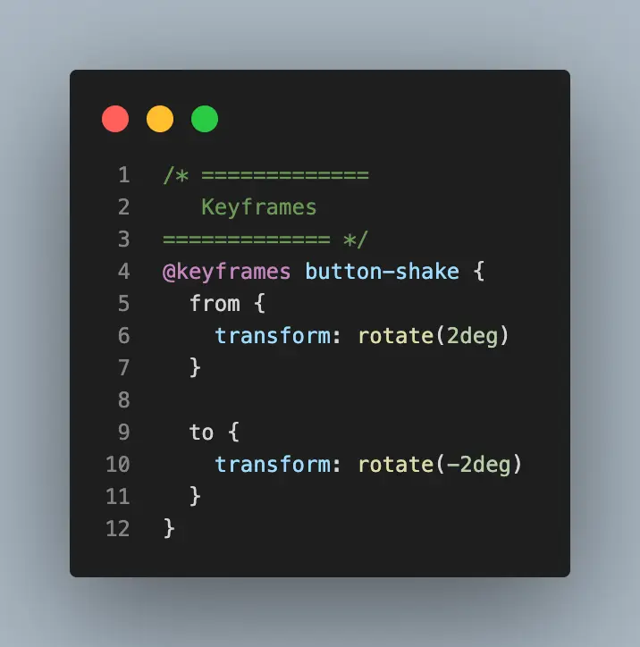
@keyframes button-shake {
  from {
    rotate:2deg
  }
  to {
    rotate:-2deg
  }
}
This takes the element and rotates it a little bit clockwise and then a little bit counterclockwise. This creates a nice effect on hover.
@media (hover: hover) {
 nav a:hover {
 animation: button-shake 0.3s linear;
   }
}
I am nesting it inside@media (hover: hover)because that will limit the animation to only devices that have hover (don't use the animation on mobile). If you don't do this, you'll notice the animation firing off when you tap on an element which looks weird.
With any kind of optional movement on your site, you also should take a look at the prefers-reduced-motion media query to make sure the animation is turned off for people who have movement sensitivities. All I had to do was add this snippet to my CSS file.
@media (prefers-reduced-motion: reduce) {
  nav a:hover {
    animation: none
  }
}
And we're done!
Comments
- No comments yet.


Related Posts

I Use TailwindCSS Except in These Three Scenarios
 6 min read
TailwindCSS is an excellent tool for streamlined styles and layouts in your web application. While it fits many use cases, I propose three scenarios that do not fit well: Pseudo-elements, focus/hover states, and transitions/animations. See how my hybrid approach, which leverages Tailwind classes + component-level scoped CSS, leads to better code readability and maintainability.
Solve CloudFlare's 'Auto Minify' and Subresource Integrity Conflict
1 min readFix CSS and JS breaking on your website caused by CloudFlare's 'auto-minification' by turning off optimizations and implementing minification server side.
0

John Solly
A hands-on AI practitioner who transitioned to a CTO role to broaden my impact.
Most of my career has been dedicated to developing spatial systems at Esri, startups, and federal agencies. Currently, I lead technology strategy for Leidos' Health IT division, supporting agencies such as SSA, VA, and HHS.
My primary focus is the convergence of spatial computing and AI, enabling machines to interpret the physical world and applying these capabilities to meaningful missions.
Please reach out if you are interested in spatial systems or advancing AI within the federal government.
0